Jan 27, 2025
7 min read
Building a Strong Brand Identity: A Designer’s Guide
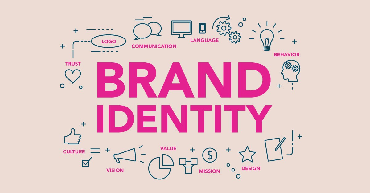
Brand identity is more than just a logo—it’s the essence of how a brand presents itself to the world. A well-crafted brand identity creates recognition, trust, and emotional connections with an audience. It influences consumer perception and builds loyalty over time.
What is Brand Identity?
Brand identity is the visual and communicative expression of a brand’s personality and values. It encompasses:
✅ Logos – The symbol or wordmark representing the brand.
✅ Typography – The fonts used in branding materials.
✅ Color Schemes – The palette that evokes specific emotions.
✅ Imagery & Graphics – Photos, icons, and design elements that reinforce brand messaging.
✅ Tone & Voice – The style of communication, whether formal, playful, or authoritative.
A strong brand identity ensures that all these elements work cohesively to tell a consistent and compelling story.
Designing an Effective Brand Identity
1. Align Design Elements with Brand Values
Every design choice should reflect the brand’s mission, values, and target audience. For example:
Luxury brands (e.g., Chanel, Rolex) use elegant serif fonts, gold or black tones, and minimalist layouts to convey sophistication.
Tech startups (e.g., Google, Slack) often use bold sans-serif fonts, vibrant colors, and playful icons to express innovation and approachability.
Eco-friendly brands (e.g., Patagonia, The Body Shop) incorporate earthy tones, handwritten fonts, and natural textures to emphasize sustainability.
🔹 Pro Tip: Create a brand mood board to visualize how these elements come together.
2. Typography: Choosing the Right Fonts
Typography significantly impacts how a brand is perceived. Common font styles and their associations include:
Serif Fonts (e.g., Times New Roman, Garamond) – Traditional, sophisticated, and high-end.
Sans-Serif Fonts (e.g., Helvetica, Montserrat) – Modern, clean, and approachable.
Script Fonts (e.g., Pacifico, Great Vibes) – Elegant, personal, and creative.
Display Fonts (e.g., Bebas Neue, Impact) – Bold, attention-grabbing, and distinctive.
🔹 Best Practice: Limit font choices to 2–3 complementary fonts to maintain consistency.
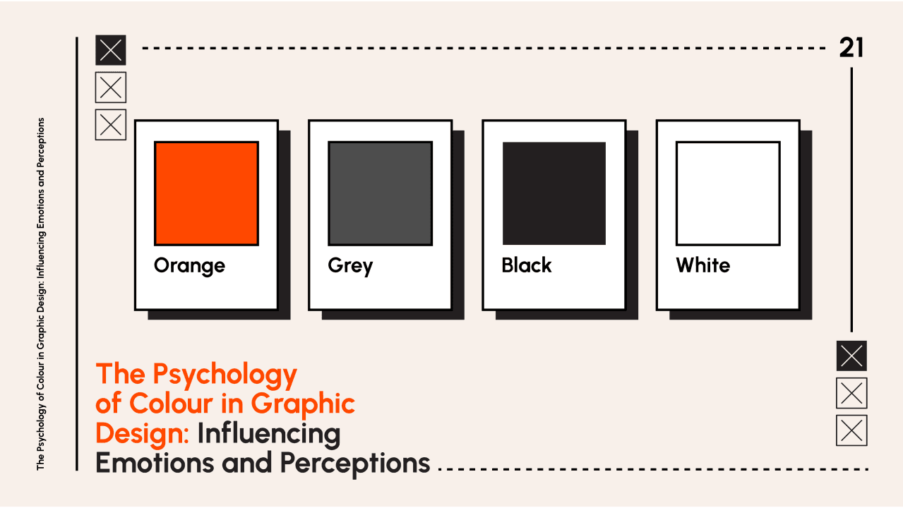
3. Color Psychology in Branding
Colors evoke emotions and perceptions. Choosing the right palette is crucial:
Red – Energy, passion, urgency (e.g., Coca-Cola, Netflix).
Blue – Trust, professionalism, reliability (e.g., Facebook, IBM).
Yellow – Optimism, happiness, warmth (e.g., McDonald’s, IKEA).
Green – Sustainability, health, growth (e.g., Whole Foods, Starbucks).
Black & White – Elegance, simplicity, luxury (e.g., Chanel, Apple).
🔹 Pro Tip: Use a primary color (main brand color) and secondary colors (accents) to create a balanced identity.
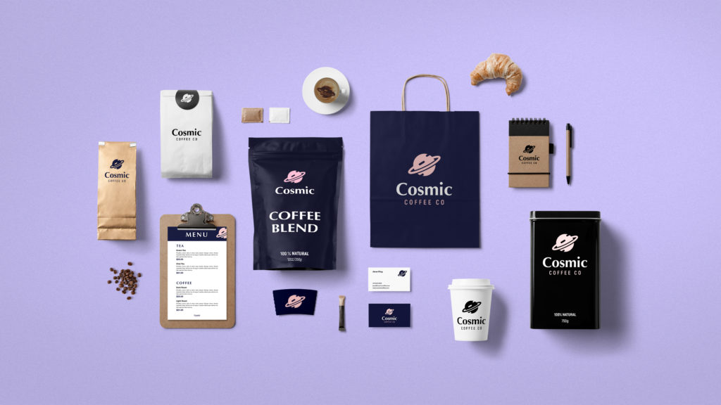
4. Imagery & Graphics: Enhancing Brand Storytelling
Visual content should align with brand messaging. Consider:
Photography Style – High-end brands use polished, professional images, while casual brands may use candid or lifestyle shots.
Illustrations & Icons – Custom icons and illustrations create uniqueness.
Textures & Patterns – Can reinforce brand personality (e.g., rough textures for rugged brands, soft gradients for futuristic brands).
🔹 Best Practice: Maintain a consistent visual aesthetic across all materials.
5. Consistency: The Key to a Cohesive Brand
Brand identity must remain consistent across all touchpoints:
Website & Digital Presence – Fonts, colors, and layouts should match the brand’s style.
Marketing Materials – Business cards, packaging, and brochures should align visually.
Social Media – Use consistent templates, filters, and graphic styles.
Advertising & Signage – Whether online ads or physical store designs, brand consistency builds recognition.
🔹 Pro Tip: Create a brand style guide to ensure consistency across platforms.
Beyond Aesthetics: Brand Identity as a Storytelling Tool
A strong brand identity isn’t just about looking good—it’s about telling a compelling story that resonates with customers. It should answer:
Who are we as a brand?
What values do we represent?
How do we want customers to feel?
For example, Nike doesn’t just sell shoes—it sells empowerment and motivation. Their bold typography, high-contrast images, and inspirational messaging all reinforce their brand story.
Conclusion: Creating a Memorable Brand Identity
Building a strong brand identity requires a strategic approach to design and communication. By aligning typography, colors, imagery, and messaging with brand values, businesses can create a cohesive and impactful presence. Consistency across platforms ensures trust and recognition, while effective storytelling turns a brand into an unforgettable experience.
💡 Final Tip: Keep refining your brand identity over time to stay relevant and resonate with evolving audiences.